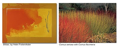
And it is not just the bold use of color that makes this analogy; it is the philosophic stance of the artists that resonates with me. Painter Barnett Newman described the drive to paint, "What is the explanation of the seemingly insane drive of man to be painter and poet if it is not an act of defiance against man's fall and an assertion that he return to the Garden of Eden? For the artists are the first men." Likewise, if the design of landscapes is not fundamentally a humanistic endeavor, then it fails. Naturalistic design is not about imitating nature, it is an interpretation of nature that expresses the human condition. Both the painter and the architect create space for dwelling. Here Newman's painting declares space in the same way the birch grove does:
What was liberating about this style of painting was that in communicating a pure emotion, in expressing space, or in holding a void, the painting was liberated from the canvas. Great planting design likewise liberates a space from the confines of the site or property line. It gives the site a feeling of expansiveness by recalling a larger moment of nature. Or better yet, it arouses a longing for nature that is embedded in each of us.
Helen Frankenthaler once said, "A really good picture looks as if it's happened at once. It's an immediate image. For my own work, when a picture looks labored and overworked, and you can read in it. And I usually throw these out, though I think very often it takes ten of those over-labored efforts to produce one really beautiful wrist motion that is synchronized with your head and heart, and you have it, and therefore it looks as if it were born in a minute."So in looking at the paintings I love, it becomes increasingly clear: the only planting worth doing is big, bold, and gestural. Strive for expansive, moody, luminous design. And remember that best naturalist design is first humanist.


I have seen the artwork before.
ReplyDeleteI have seen the gardens before.
But I have never seen the gardens and the artwork together, quite like this.
Thank you.
I love the design of this post. The paintings & landscapes, perfectly matched, make a beautiful composition. I have a problem with the premise. Landscapes are not like paintings. Paintings are flat & static, while landscapes are experienced by moving through them, both physically & temporally. Landscapes should not look as though they were ‘born in a minute,’ but as though they evolved over time. I fear that a landscape as simple & bold as these paintings, satisfying when seen for a moment, would become a shallow experience to those who lived in them forever. It was good to read a blog post that made me think & feel.
ReplyDeleteFascinating juxtapositions!
ReplyDeleteThis concept will stay in my mind's-eye whenever I look at a gardenscape.
Alice
aka Bay Area Tendrils
Jordan,
ReplyDeleteI agree with you . . . landscapes should not be static and two-dimensional. Landscapes have been influenced by paintings for hundreds of years (think about the Picturesque movement in Britain). The legacy of that effect has not been good, as the analogy of paintings forces landscapes to be perceived as static pictures, not dynamic spaces.
However, most of my blog advocates to get beyond the picturesque (see the Hyper-Nature entry) for exactly the reasons you mention. The paintings I showed in this post resonated with me precisely because their energy and spirit elevated them beyond the confines of the canvas. I showed them to advocate for planting designs that boldy celebrate the ephemeral through mystery, intringue, and discovery.
Thomas
Great post and so much easier to read than that turgid tome of a set text 'The Poetics of Space' which, whilst saying similar things, always struck me as having been translated from German by a hermetic poet . My favourite line is 'Not a picture, but an event'. Isn't that why you are an 'LA by profession but gardener by obsession' - and why the greatest space creators have dirty hands.
ReplyDeleteArt can be created with a china brush or a white sagebrush. I like to use bicycles, buses and baseball bats. Beautiful comparison between the paintings and the plantings.
ReplyDeleteThomas, this is yet again a worthy moments worth of reading, beautifully presented and stated, you continue to encourage me to a greater visions of art, gardens and landscape design! Thank you again.
ReplyDeleteI'm so glad I found your blog! I'm an abstract expressionist painter and can totally relate to your statement that "the only planting worth doing is big, bold, and gestural". I work along idea/conviction both in my art and my garden/landscape design.
ReplyDeleteBeautiful visuals, I'm looking forward to looking at and reading all of your blog entries.
Thanks you!
I'm just a few minutes new here, and I've fallen in love with your blog. Bravo!
ReplyDeleteThomas: These juxtapositions are rewarding....I was looking at Joan Mitchell's paintings and it lead to you...makes sense.
ReplyDeleteSincerely....
That the best naturalist design is first humanist, I very much agree with. That the only planting worth doing is big, bold, and gestural, not so much. There is certainly a place for subtle, intricate and restrained.
ReplyDelete